UI/UX Design Case study · Fintech
Re-architecting eNPS subscriber
onboarding
- Role
- UI/UX Designer
- Timeline
- 2025 — 2026
- Team
- 2 Designers
- Deliverables
- UX/UI Design · Responsive Design
Overview
Making pension onboarding easier to navigate
NPS enables individuals to open and manage their pension accounts digitally. But as the subscriber journey evolved, the experience became increasingly complex, with information, decisions, and actions spread across multiple stages.
The opportunity was to rethink the journey as a whole; not simply redesign individual screens.
- UX Strategy
- UX/UI
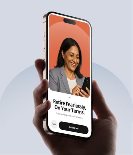
- Mobile Experience
Problem
The journey worked. The experience didn’t.
The existing onboarding journey had become difficult to navigate. Users encountered dense information, multiple decisions, and disconnected steps without always having a clear understanding of where they were or what came next.
The challenge wasn’t to reduce the number of screens.
It was to make the journey easier to understand.
- Home
- Registration
- Aadhar KYC
- Personal Info
- Contribution
- Bank Info
- Nominee
- Scheme
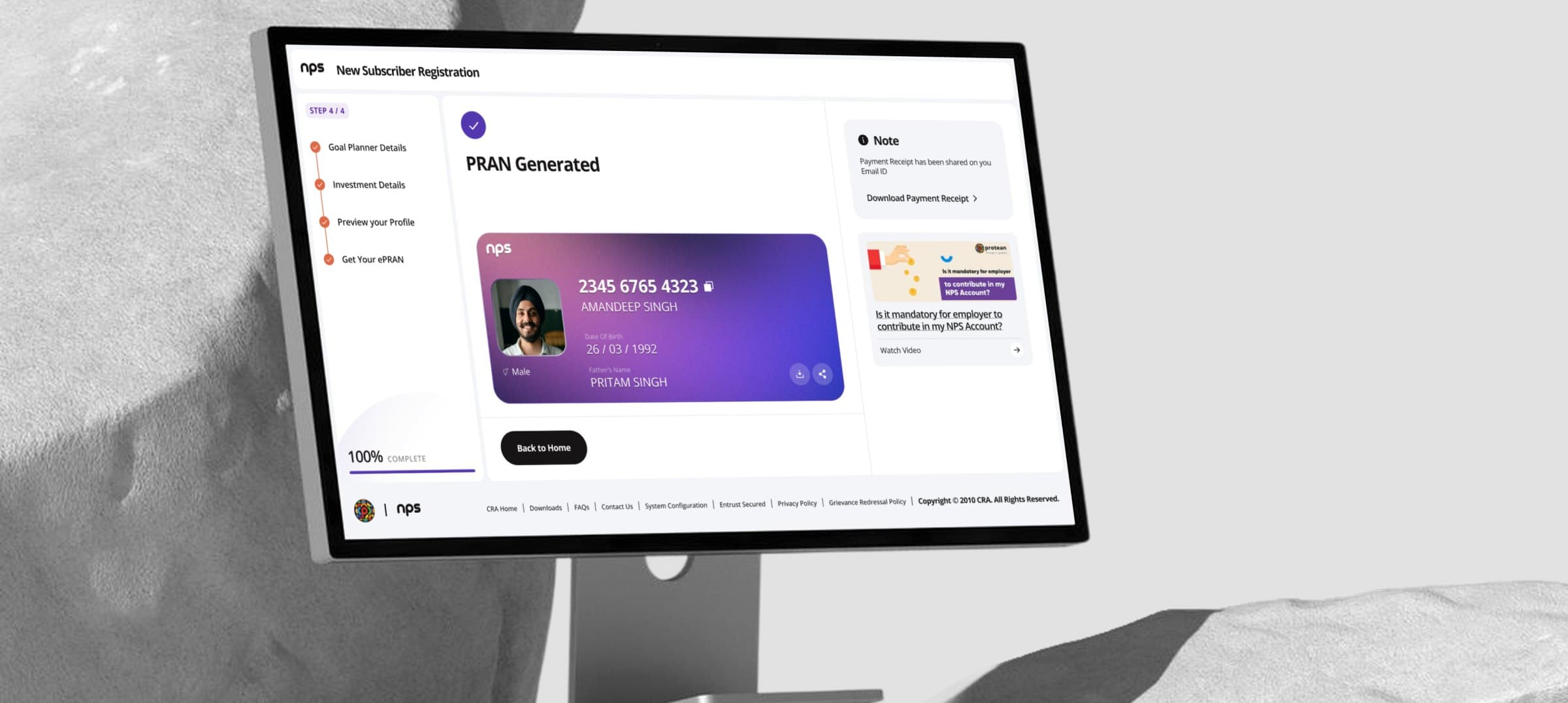
- Confirmation
- Payment


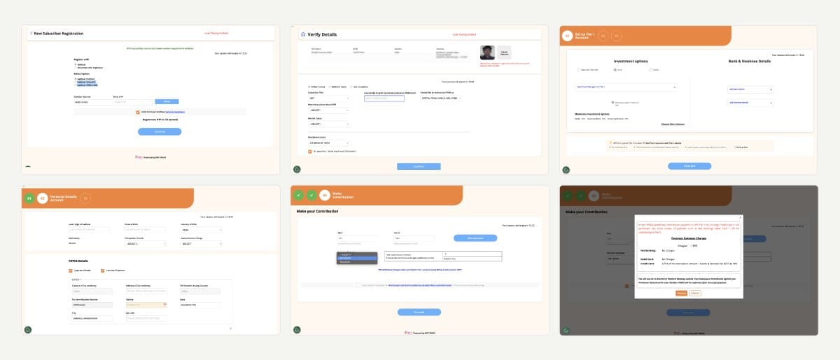
UX Audit
The complexity was in the journey, not a single screen
I mapped the existing experience end-to-end to understand how information, decisions, and actions were connected.
This helped identify where the experience was creating unnecessary cognitive load, where steps could be better grouped, and where users needed more context before making a decision.
A fixed path with little flexibility
The onboarding experience moved users through a predetermined sequence, making it difficult to recover when something went wrong.
Key decisions were easy to miss
Important choices were embedded within information-heavy screens instead of being clearly surfaced at the right moment.
Verification caused backtracking
Verification created unnecessary backtracking. When verification failed, users could be taken back through previously completed parts of the journey.
The Solution
From a collection of steps to a guided onboarding experience
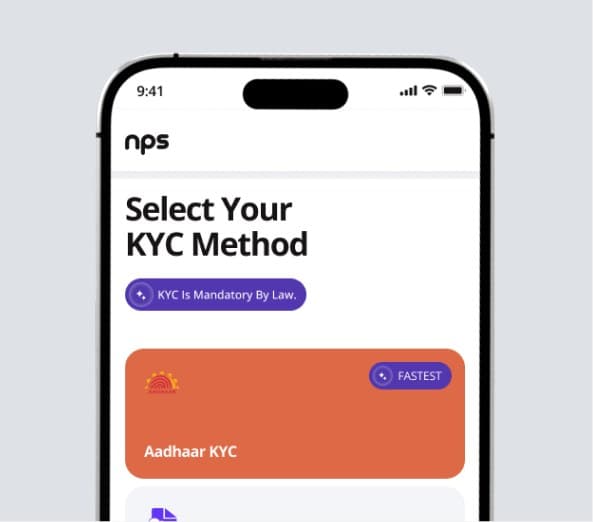
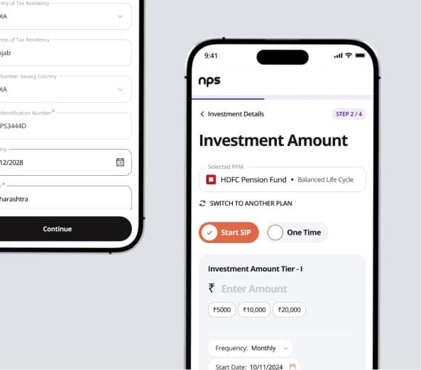
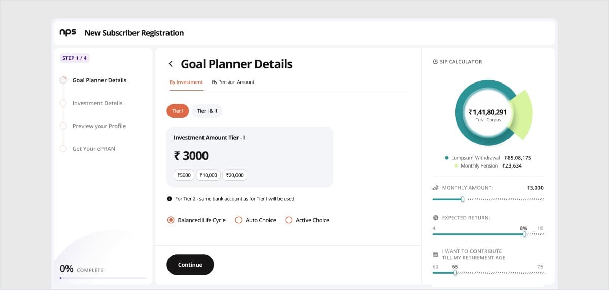
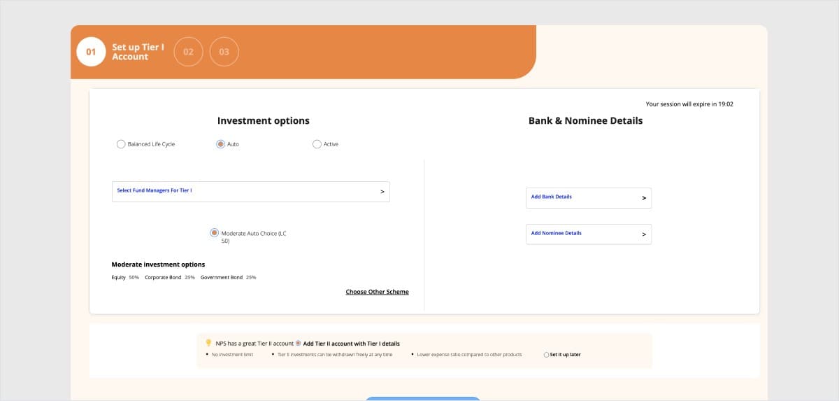
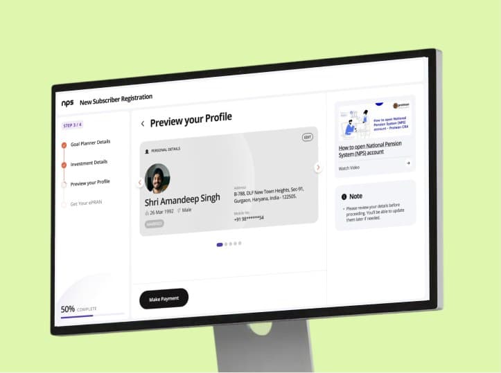
The redesign moved away from the long, single-path structure and reorganised the journey around meaningful tasks and decisions.
Related steps were grouped together, important choices were surfaced earlier, and the experience was structured so users could move forward without repeatedly retracing completed steps.
- Understand
- Choose
- Provide Details
- Review
- Complete

Simplified the journey
Reduced unnecessary movement between related steps and created a clearer progression.
Surfaced key decisions
Brought important choices into the flow instead of burying them inside lengthy forms.
Improved recovery
Allowed users to correct issues without losing previously completed information.
Created clearer checkpoints
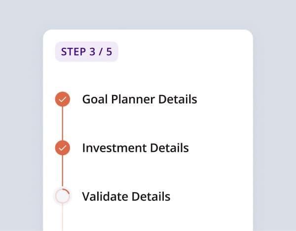
Introduced stronger separation between major stages so users could understand where they were and what came next.
Before → After
Making every step easier to understand
The goal was to design a platform that could simplify the entire agency-brand relationship while addressing the very different needs of both users.
- Brands: discover, evaluate, shortlist, and start projects with agencies
- Agencies: build visibility, respond to opportunities, manage teams, and run ongoing business
Design Decisions
Designing around the decisions users need to make
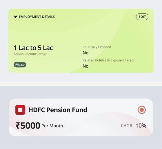
Group related tasks
Instead of treating every form as a separate step, related information was brought together into clearer sections.
Why: Reduce unnecessary context switching.
Preserve progress
The flow was designed to retain completed information when users encountered an error or needed to revisit a step.
Why: Prevent users from repeating work they had already completed.
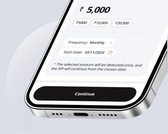
Put decisions closer to context
Important choices were presented alongside the information needed to understand them.
Why: Help users make informed decisions without searching through the journey.
Make progression clearer
Major stages were separated into understandable checkpoints with clearer next actions.
Why: Give users a stronger sense of orientation throughout a long onboarding process.
Key Takeaways
The biggest change wasn’t visual. It was structural.
This project reinforced that complex experiences aren’t necessarily solved by reducing the number of screens.
The more important question is how those screens connect—what information users receive, when they make decisions, what happens when something goes wrong, and whether the system remembers the work they’ve already done.
What I took away:
- A strong information architecture should come before visual styling.
- Error recovery needs to be designed as part of the main journey.
- Users should be able to pick up where they left off without repeating completed steps.
- Important decisions should appear when users have enough context to make them.
- Simplifying a journey doesn’t mean removing information; it means structuring it better.
- Good product design considers the entire journey, not just individual screens.